
Europe's productivity keeps outpacing the US
A closer look at some famous statistics.


UPDATE: Paul Krugman comments in a post on his Substack: “This post was inspired in large part by an extremely informative post by Seth Ackerman that has generated a lot of discussion in the circle of economists who worry about such matters.”
Since COVID, a narrative about economic stagnation in Europe alongside booming productivity in America — “Eurosclerosis,” to use an old but newly fashionable term — has attained the status of accepted fact in discussions of global politics. Though analysts may differ about what conclusions to draw or what steps should be taken, the “fact” itself is seldom questioned.
Since all of the relevant numbers on this subject come from a handful of marquee statistical series produced by leading international organizations — and since they’re all constantly scrutinized and litigated by legions of economists and policy experts — you might think the raw facts contained in them would be a settled question. But there’s a serious problem lurking in these data, one that seems to have gone entirely unnoticed in the discourse.
To compare GDP levels between countries, raw monetary figures — like the UK’s 2.9 trillion pounds of 2024 GDP or the US’s 29.2 trillion dollars — have to be converted to a common unit of measure. This is typically done using purchasing power parities (PPPs), which are like ordinary exchange rates, but adjusted for differences in national price levels.
For example, in 2024 the UK’s market exchange rate was 0.782 pounds to the dollar, meaning 100 US dollars could buy 78.2 pounds on the currency market. But according to the PPP data, a basket of goods that cost $100 in America only cost 66.4 pounds in the UK, because the UK price level, after converting from dollars to pounds, was about 15% lower than America’s. At the PPP ratio of 0.664, therefore, UK GDP was about 15% higher than at market exchange rates: $4.2 trillion vs. $3.7 trillion.
The national price levels that go into these calculations are measured just as you might expect: armies of clipboard-wielding field economists in countries around the world collect prices on thousands of products, which are then carefully matched with comparable products in other countries. This global effort is coordinated by the International Comparison Program (ICP), an official UN body housed at the World Bank, which releases a fresh set of global estimates every few years, most recently for 2021.
According to these data, which are available at the World Bank’s website, the 17 countries of Western Europe1 had a combined PPP-converted GDP of $28.8 trillion in 2024 — almost identical to the US’s $29.2 trillion. If you go back a decade, to 2014, the numbers are, again, almost identical: $17.2 trillion versus $17.6 trillion. Go back another decade, to 2004, and the numbers are once again essentially the same: $11.9 trillion versus $12.2 trillion.
Judging from these figures, Europe’s GDP would seem to be keeping pace with America’s just fine, pace conventional wisdom. Why, then, do we constantly hear the opposite?
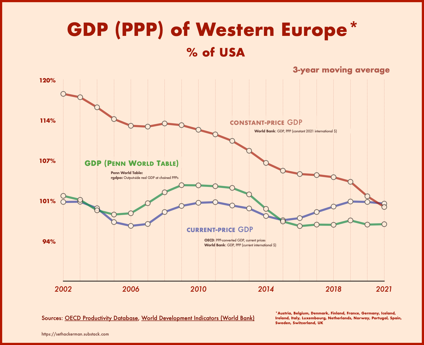
The answer is that there are two PPP-converted GDP data series, and they tell completely different stories about Europe’s relative performance.
In addition to the series from which the numbers above are drawn, which is labeled “GDP, PPP (current international $)” in the World Bank dataset, there’s another series called “GDP, PPP (constant 2021 international $)” Nearly identical twinned series are published by other institutions, such as the OECD’s ”PPP-converted GDP, current prices” and “PPP-converted GDP, chain-linked volume.“ For brevity, I’ll refer to these two types of data generically as current-price and constant-price GDP.
Although the two metrics give similar numbers for the most recent year (2024), the constant-price series diverges further and further from the current-price series the deeper you go back in time, with Europe appearing to get richer and richer relative to America, and thus poorer and poorer as you approach the present.
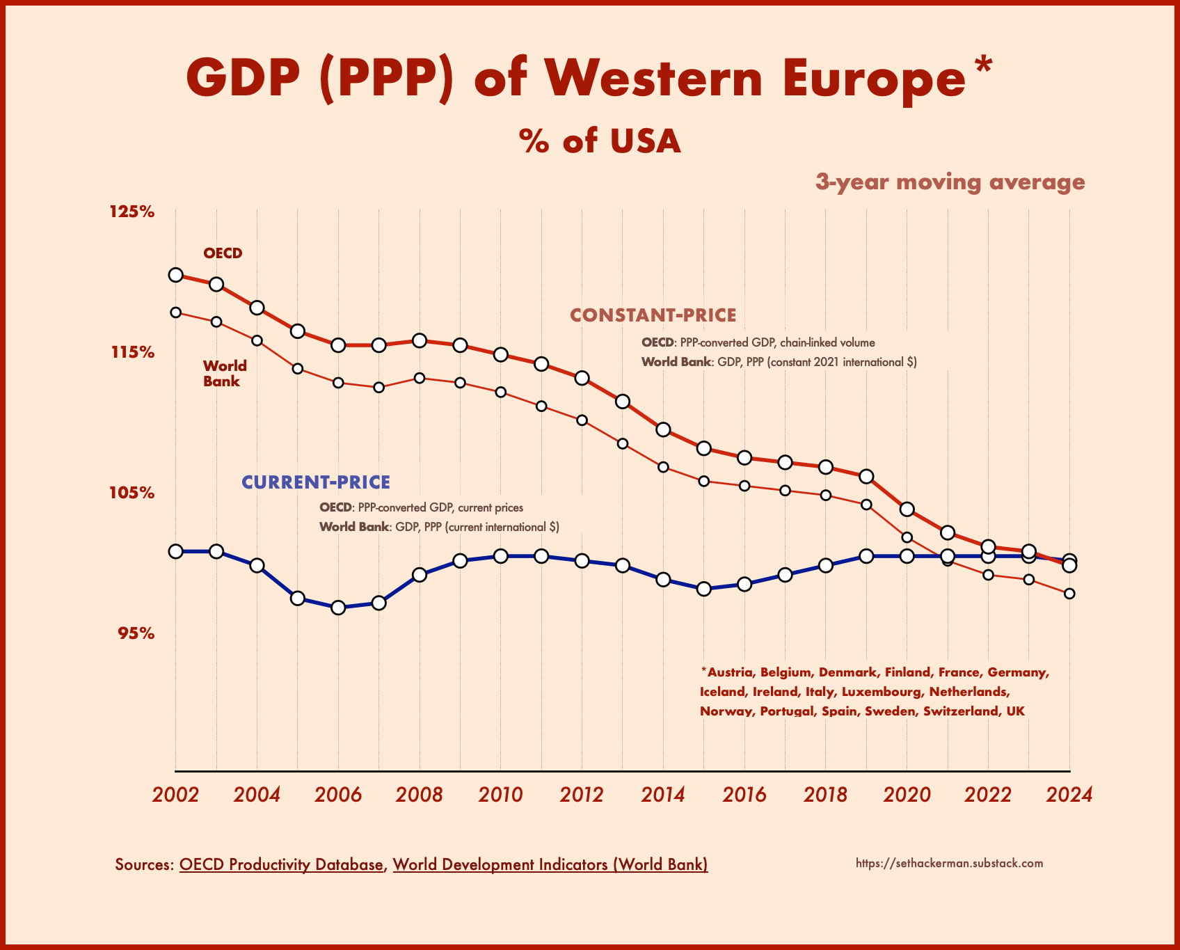
According to the constant-price GDP metric, US output exceeded Europe’s by 4.3% in 2024. But go back a decade earlier, to 2014, and the positions are reversed, with Europe’s GDP exceeding the US’s by 5.5%. Go back another decade, to 2004, and Europe’s advantage grows to 13.7%.
Go all the way back to 1990, the start of the World Bank series, and Europe’s GDP is reported to be 30% larger than America’s. Those who claim that Europe’s economy is lagging rest their case on the credibility of these numbers.
The organizations that publish these series typically explain the difference between them by saying that current-price PPPs are appropriate for comparing GDP between countries at a single point in time while constant-price PPPs are designed for comparisons across different years.
But clearly something is missing from this explanation because, logically speaking, it can’t both be the case that the US and Europe had the same GDP in 2014 and the same GDP again in 2024 (per the current-price series), and also that America’s GDP grew dramatically faster than Europe’s between those years (per the constant-price series).
To understand what’s really going on with these numbers, consider the following example: suppose in a given year the US produces 1 million watches and 500,000 clocks while Europe produces 1 million clocks and 500,000 watches. If the price of both products, in both countries, is equal to 1, the level of GDP is the same in both places (1.5 million).
Then suppose the following year the numbers remain unchanged, except that the price of watches falls to 0.9. Since the US is more specialized in watch production while Europe is more specialized in clocks, America’s GDP in “current prices” will have fallen relative to Europe’s (by 3.4%), even though the physical volume of production in both places remains exactly the same as before2.
This is why, to get a purely real (”physical”) measure of internationally comparable GDP growth over time, you have to adjust not only for differences in overall national price levels (as the current-price series does) but also for changes in relative product prices over time, so that countries’ production volumes don't appear to be rising or falling just because they happen to produce goods whose prices are moving up or down. This adjustment for changing product prices is the raison d’être of constant-price GDP.
But while, conceptually, such adjustments make sense, there is a huge problem with the way the statisticians go about it. Whereas the current-price series converts each year’s GDP into internationally comparable dollars using the PPP ratios derived from the ICP’s global price comparisons, the constant-price series does this only for the current year’s GDP. For all prior years, the numbers are simply extrapolated backwards using the annual GDP growth rates published by the various national statistical agencies. Thus, the higher a country’s official growth rate, the poorer it appears to have been in the past (and vice versa).
Of course, each national statistical agency duly adjusts for changing product prices within its own economy, using methods that presumably ensure internal consistency over time. But in adopting these growth rates for purposes of international comparison, the constant-price GDP series simply assumes that different countries’ growth statistics are, in fact, comparable: that when countries measure their own GDP — including, crucially, the price indexes used to convert nominal into real GDP — they use mutually consistent concepts and methods.
Unfortunately, that is not the case. This becomes painfully obvious when you look at prices for tradable manufactured goods. Although the actual prices of such goods, in a globalized economy, march practically in lockstep across countries, there is no such uniformity in the official price statistics, which reflect the idiosyncratic measurement methods employed by different national statistical agencies — in particular the highly subjective techniques they use to adjust for changes in product quality over time.
Those methods are all over the map. For example, a 2019 article by a Federal Reserve economist highlights the “mysterious” and “wildly different” rates of decline in official price indexes for mobile phones over the years 2008-2018. These ranged from -18% in Australia, to -52% in the US and Canada, to more than -90% in the UK and New Zealand. “The magnitude of this variation is highly implausible,” the author notes drily, stressing “the need for international harmonization.”
A 2023 paper by a former Japanese Ministry of Finance economist reports that while television-set prices declined by 85% in the US (BLS) price index over 2005-2015, they increased by 8% in Japan’s official statistics.
Even within the European Union, where statistical procedures are subject to a strong dose of harmonization, thanks to Eurostat, Bundesbank economists noted recently that in 2017-2021, measured price declines for mobile phones ranged from -16% in Germany to -50% in Italy, even though, according to barcode-scanner data, the actual rate of price change in those countries was identical. “Our findings emphasize the need for greater harmonization and transparency,” the authors conclude.
To be sure, the official statistics have some points in their favor. National statistical agencies are uniquely able to measure prices at very fine levels of product detail and to aggregate them with precisely measured weights. For many products, especially non-tradable services, it may be hard to find exact equivalents across countries, as required for accurate PPP comparisons. There are also, perhaps, less lofty reasons why Big Stat might prefer to simply copy-and-paste official growth rates into the PPP numbers (a question I’ll return to below).
Whatever the reasons, the end result is a serious problem of inconsistency in the data: each time the ICP carries out a new round of global price comparisons, it finds trends in cross-country relative price levels that conflict dramatically with those implied by the various national price indexes. Instead of taking that information on board, the organizations effectively sweep it under the rug, plucking out a single year’s PPP-adjusted GDP to “anchor” the data, then filling in the growth rates with numbers from the national accounts.
Over time, such inconsistencies accumulate, yielding historical absurdities like the notion that the US economy was 30% smaller than Western Europe’s in 1990 — or that productivity in Italy was 20% higher than in the US. (Yes, that’s what the OECD data say.)
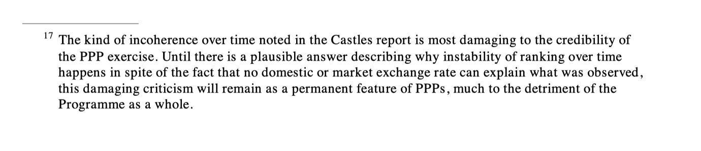
I’m not, of course, the first person to notice this problem. It’s been discussed in the technical literature for years. As far back as 1998, the Ryten Report, a high-level independent review of the PPP program solicited by the IMF and World Bank, warned that the problem of “incoherence over time” was “most damaging to the credibility of the PPP exercise” and that this “damaging criticism” would haunt the program “until there is a plausible answer.”
It was in response to such criticism that, more than a decade ago, economists at the University of Groningen’s Growth and Development Center (GDC), stewards of the venerable Penn World Table (PWT) dataset, began developing an alternative set of PPP metrics that don’t simply copy-and-paste official growth rates. And since the GDC serves as a kind of R&D lab for the global PPP project3, its judgments carry more than usual weight.
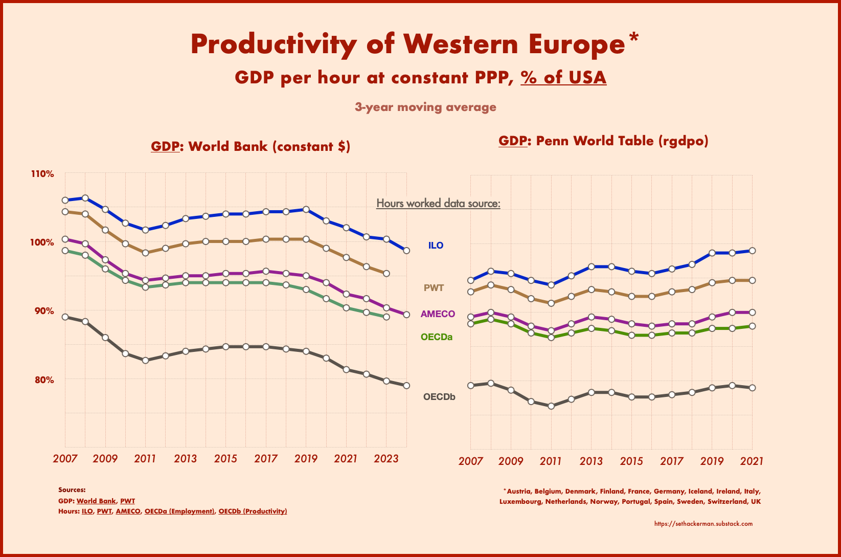
The key GDP metric that emerged from this work, labeled rgdpo in the PWT dataset (r for “real”; o for “output”), is designed to address the shortcomings of both current-price and constant-price PPPs.
Unlike current-price GDP, rgdpo adjusts for changing product prices over time, avoiding the watch/clock problem described above. Unlike constant-price GDP, it accepts the reality of the price-level trends found in successive ICP waves, using data from the national accounts only to “interpolate” for years between ICP rounds and “extrapolate” for years since the latest round. This eliminates the inconsistency problem. (By necessity, this means rgdpo only gives distinctive results for years up to 2021, the last ICP comparison year, which is why the charts below stop at 2021.)
The newest PWT results, just released last October, are unequivocal: Europe’s performance as measured by rgdpo looks a lot like the current-price GDP series — with its steady trend relative to the US — but nothing like the downward-sloping constant-price series4.
And if we use the data to calculate productivity growth (GDP her hour worked), it turns out that, far from lagging the US, Europe is gaining on it: its productivity was 92%, 94%, and 94% of the US level in the early 2010s, late 2010s, and 2020s, respectively — figures that rise to 96%, 97%, and 98% if we use ILO hours data, which are likely more comparable5.
It’s certainly possible that at some point in the future international statistical bodies could end up adopting the PWT approach. But even setting technical obstacles aside, it’s easy to see why they might be reluctant.
The growth rate of GDP, like a papal bull, is a solemn pronouncement of truth, handed down from on high, on a question of profound temporal (and to some devotees of the GDP cult, spiritual) importance. If organizations like the World Bank and OECD were to opt for the PWT method, there would henceforth be “two GDP growth rates,” akin to the two popes of the Middle Ages.
Heretical questions would be sure to follow. Who knows what bedlam might ensue?
Austria, Belgium, Denmark, Finland, France, Germany, Iceland, Ireland, Italy, Luxembourg, Netherlands, Norway, Portugal, Spain, Sweden, Switzerland, and the UK. In this article, “Europe” refers to these countries.
While this sounds similar to the terms of trade, it doesn’t depend on which products a country imports or exports; it only matters which products the country produces.
The PWT began its life as the flagship product of the University of Pennsylvania’s International Comparisons Unit, a UN-sponsored research group led by Robert Summers (father to Larry) that pioneered the collection of global PPP data in the 1960s. The unit was absorbed into the official UN statistical apparatus in the 1970s and is now the International Comparison Program. The PWT, now housed at the GDC, lives on as an independent research program, with close institutional links to the official statistical organizations. .
This shouldn’t really be surprising: economic forces already see to it that rich countries produce similar products; they do nothing to ensure the comparability of government statistics.
Although different international databases (OECD, PWT, ILO, AMECO) give similar numbers for total hours worked in Europe, they differ wildly for US hours. Of these, the ILO numbers are closest to those found in the BLS’s now-defunct International Labor Comparisons (ILC) database, which was expressly harmonized for US comparability. (The ILC was eliminated in 2013 due to sequestration budget cuts; its data end in 2011.)
Seems better to use GDP per capita PPP Constant 2021 International $ - https://data.worldbank.org/indicator/NY.GDP.PCAP.PP.KD?locations=US-EU
If watches do become higher priced compared to clocks, then this may indicate that watches have become more valuable, so the country that produces more watches is now producing output of greater value. This should be noted, and may be important, even if the productive capacity of the two countries relatively speaking has not changed.