
FAQ about that chart
Chortling chart chuds turn churlish.


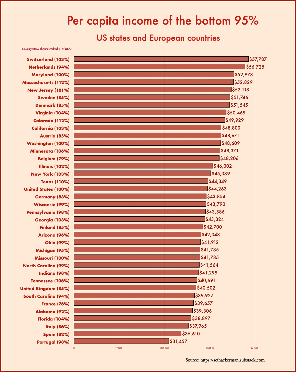
The other day I posted the chart below, along with an observation: “This type of ‘US state vs. European country’ comparison is now a flourishing genre on Twitter, I’ve noticed, where MAGA chuds chortle at the Europoors.”
Unfortunately my playfully affectionate reference to MAGA chuds was taken invidiously. A kind of bat signal went out and platoons of crypto enthusiasts went rushmaxxing onto Twitter to man the breaches. Fortunately, the damage was limited to minor confusion about income statistics.
To clear things up, here’s a Q&A about the chart.
What exactly is “pre-tax income“?
“Pre-tax income” is total national income. That is, if you add up all households’ “pre-tax” income, it sums to 100% of national income.
Is national income the same thing as GDP?
No, but they’re closely related.
GDP is the value of the goods and services produced by labor and capital physically located within the borders of (say) the USA.
If you add in the income households and companies earn from overseas production (either because they own overseas capital or do overseas work), and then subtract the mirror-image version of that (the income foreigners extract from domestic production), you get GNP.
If you subtract depreciation — the using-up of productive assets, like trucks and machines — from GNP, you get national income.
If pre-tax income is just national income, why do they call it pre-tax income? Is there a post-tax income?
Yes, there’s also a post-tax income series. It, too, adds up exactly to 100% of national income.
The point of these series is to allocate 100% of national income to the whole population and to show how government spending and taxes affect the distribution.
Pre-tax income is the sum of a person’s labor income, capital income, and income from pensions and unemployment insurance. It doesn’t matter whether the pension is part of a compulsory national system, like Social Security, or a voluntary private pension. Contributions to pensions and unemployment insurance are, correspondingly, subtracted from pre-tax income, even if they technically take the form of a tax.
Post-tax income then deducts all remaining taxes1 and adds in the value of all other government benefits and services, like Medicare and public schools. Again, the point is to account for 100% of national income.
It turns out it doesn’t matter very much whether you use pre-tax or post-tax income when making comparisons like those featured in the chart, because the share of national income that gets redistributed from the top 5% to the bottom 95% via taxes and government spending doesn’t differ greatly across countries. In the US it’s 5.8%; in Sweden it’s 6.2%. It ranges from from a low of 4% (the Netherlands) to a high of 10% (Denmark) in Western Europe.
Q: What about household size? Single-parent families and so forth?
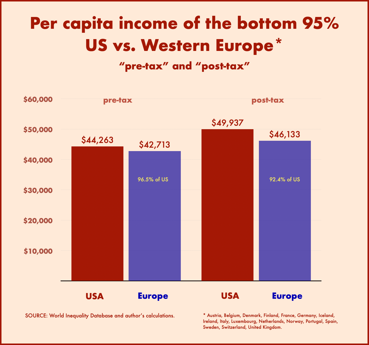
First, I should explain that the numbers in the original chart showed income per adult, with the income of joint-filing couples equally split. I should have made that clear in the original post.
You can divide this by the number of adults in each country and then multiply by the total population to get plain old per capita income. Or you can look at the WID database again and realize that those numbers were there all along and you just didn’t notice (which happens to be the case here).
In any event, using true capita income makes the US look slightly poorer, since children make up a somewhat larger share of the population in the US than in Europe. Here’s a chart showing average pre- and post-tax incomes for the bottom 95% of the population, per person (total population).
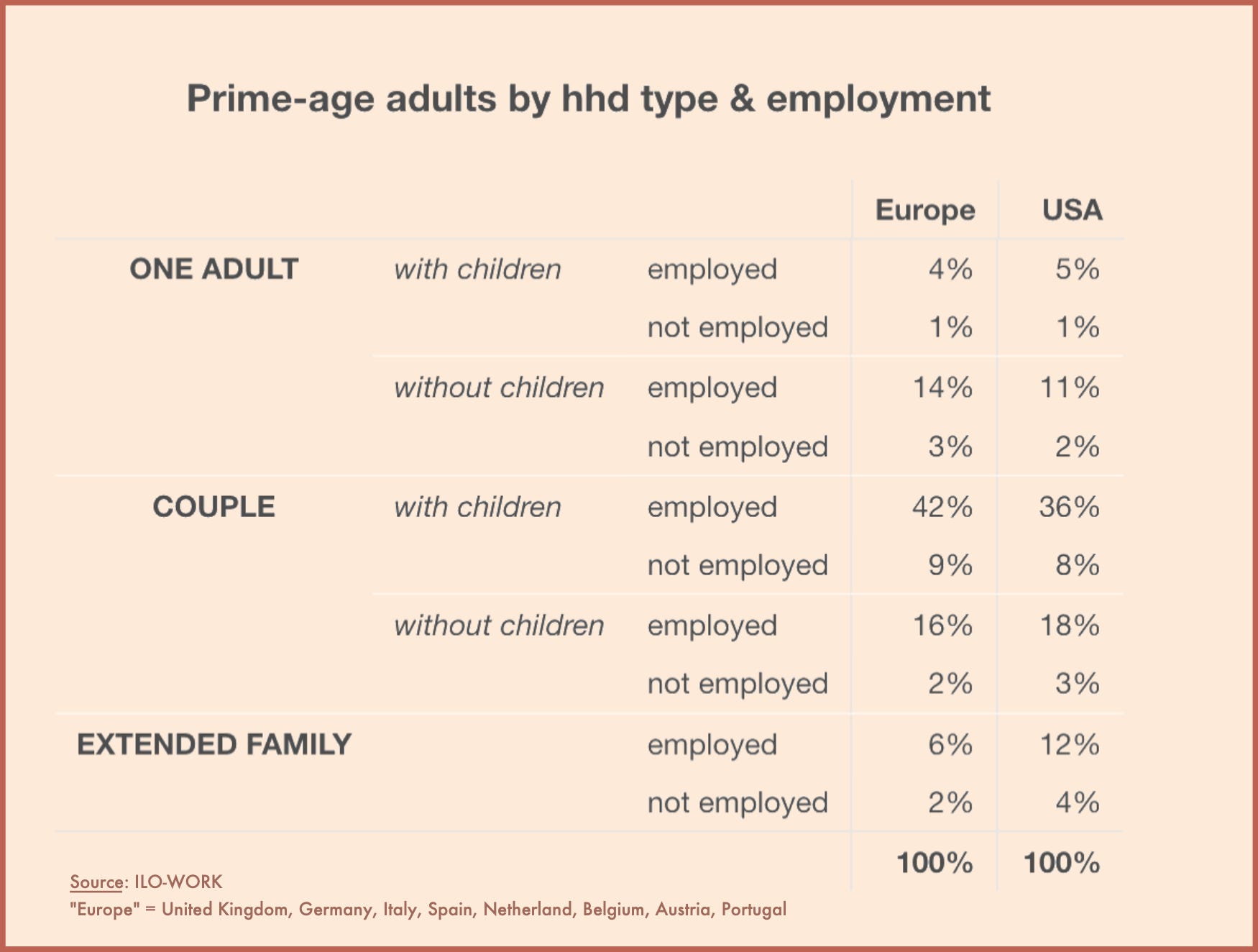
Q: And single-earner households?
Contrary to what some people assume, the US doesn’t appear to have an unusually large share of single-earner households. So that wouldn’t make a difference to the numbers in these charts.
In fact, the distribution of employed and non-employed prime-age adults (25-54) among different household types looks remarkably similar in the US and Europe. The main difference seems to be a somewhat larger share of employed adults in extended-family households in the US, balanced by a somewhat smaller share in two-adult households. Here’s a table:
Q: But what about * disposable * income?
On Twitter, someone posted a chart showing the OECD’s measure of “median disposable income,” a metric where the US truly shines:
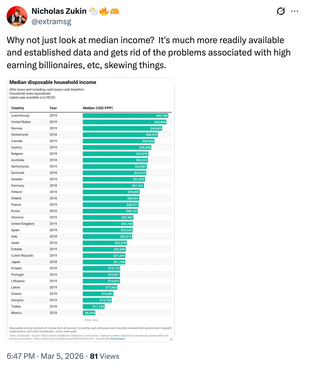
Unfortunately, disposable income captures only about a third of US national income. It deducts almost all taxes from household incomes, yet most of the stuff those taxes pay for never shows up in the income total (things like highways, or Medicare).
As the OECD’s technical manual puts it, disposable income excludes “goods and services provided by government that benefit individuals but which are provided free or at subsidized prices,” which “generally include education, health, social welfare, transport and cultural services.”
The manual further notes that this omission “presents difficulties when the provision of such services differs greatly” between countries being compared. In those countries where such public expenditures “are relatively sparse, a higher income will be required to support a particular standard of living than in a country where a wide range of benefits are provided, all other things being equal.”
Or think of it this way: if the US closed all public schools tomorrow and sent every parent a voucher worth their share of school spending, America’s “median disposable income” would instantly skyrocket. Would we be richer? Not obviously so.
[COMING SOON — A LONG POST ABOUT ISRAEL! UNSUBSCRIBE NOW IF YOU’RE NOT READY FOR THAT CONVERSATION!]
Except capital gains taxes
Glad that Norway made its way into Europe this time around
Oof, I found this confusing. 🥺